Module 9 - Late Modernism - Chapters 21 and 22
Sister Corita Kent (1918–1986)...AKA "L.A.'s Pop Art Nun" is who I am choosing to highlight this week. How did this seemingly quiet Catholic nun become a famous graphic designer of late modernism? That's what I wanted to find out for myself.
Megg's (2016) briefly covers the work that Kent accomplished, only referring to her style as childlike and as her as a bit of a rebel. According to www.corita.org, a website devoted to Sister Kent's work, she joined the art department at the University of Southern California in 1947, where she obtained her Master's degree in art. Near the end of her stint at USC, Kent began experimenting with screen printing on paper. In 1962, Kent became inspired by Andy Warhol's pop art and produced her first piece of pop art.
 |
https://www.corita.org/about/corita
|
Throughout the 1960's her art was everywhere - window displays, magazines, etc. In 1968, Corita Kent left the religious order in which she was ordained. Throughout the 1970s and 1980s, her work focused on social justice, poverty, and the antiwar movement. Her work was what was considered what is called serigraphs. Her process can be seen here: https://youtu.be/3cQeSOiqvhM  |
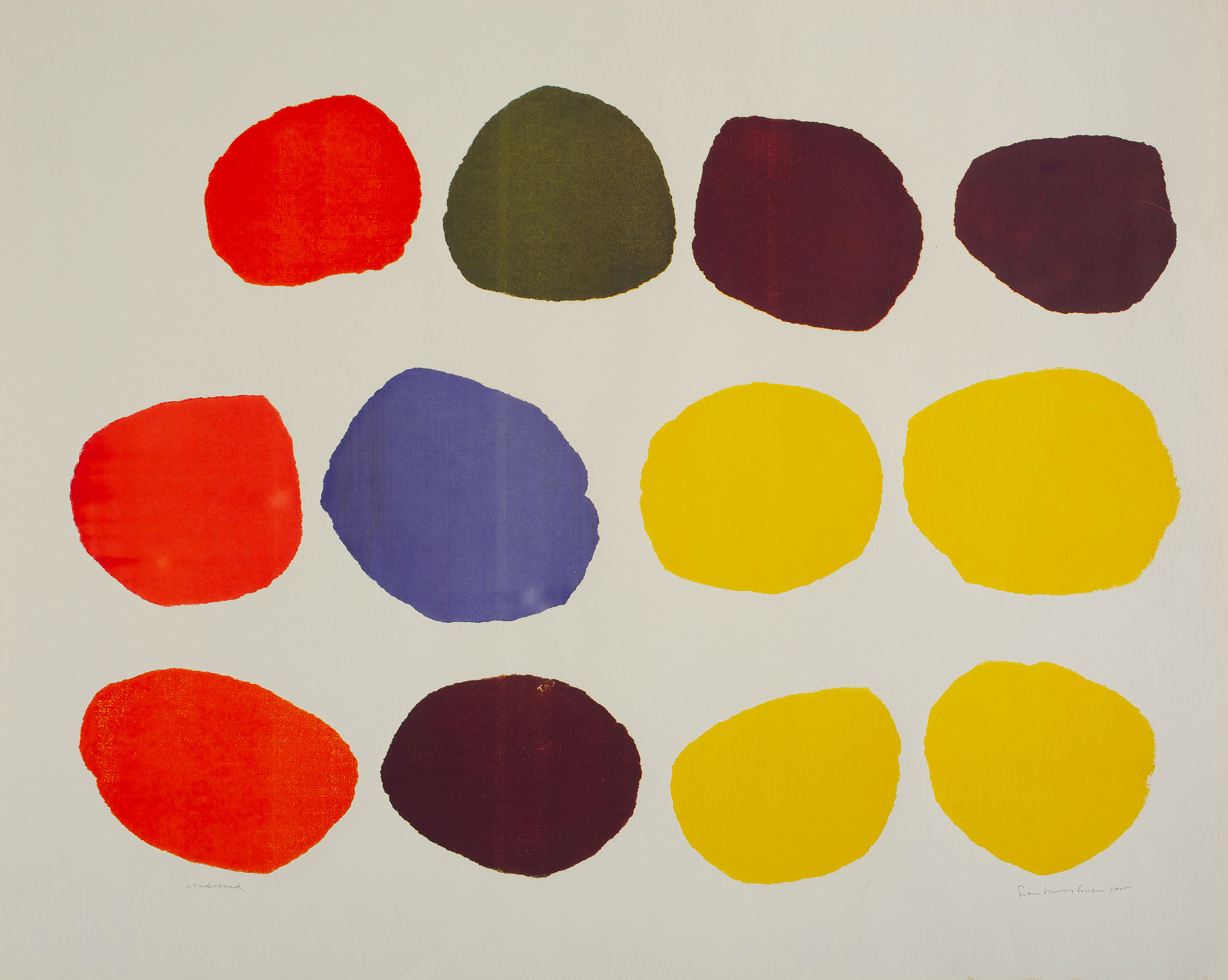
https://collection.corita.org/piece/70-08
|
Corita's passion in life was spreading joy, love, justice and compassion through her art. Many of her serigraphs depicted scripture, songs, and images of peace and love. She was a poetic artist through and through and I feel so fortunate to have learned more about this dynamic graphic designer with an usual background. If you, the reader of this blog, want to learn more about Sister Kent and her extremely large collection of serigraphs, please take the time to visit www.corita.org for more more information. You will not be sorry that you did!
https://collection.corita.org/piece/64-24
 |
https://collection.corita.org/piece/69-64
|
https://collection.corita.org/piece/64-08
https://collection.corita.org/piece/65-12
https://collection.corita.org/piece/85-06


")
")
")
")

Comments
Post a Comment